


Master Class: Color Palettes and Color Gamut
Master Class: Color Palettes and Color Gamut

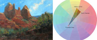
Left: "Mitten Ridge Reds" 12x16 oil/canvas. Made with the three-color palette consisting of burnt sienna,
yellow ochre and Prussian blue. Right: Color gamut of my three-color palette used in the painting.
Much basic knowledge is given to children at an early age. I don't remember when I first learned about the three primaries—red, yellow and blue—so it must have been a very long time ago indeed. The concept, as we all know, is that you can mix any color you see with these three colors (plus white.)
Or so the theory goes. Once I started seriously getting into color-mixing with my first painting course, I learned the limitations of red, yellow and blue and of pigments in general. For example, if I didn't have the right red and blue, I couldn't mix an intense violet. I'd be better off buying the intense violet I needed, like quinacridone violet.
One might think that maybe one should just buy all the exact colors needed. Pastelists usually end up doing this, and as a pastelist myself, I've done the same, but I will add that it is an expensive addiction. Some painters of liquid media do this, too. Unfortunately, acquiring a virtual candy store of color can lead to color chaos, especially if the artist doesn't understand color harmony or how to properly adjust color mixtures. I would argue that much of the truly garish, carnival-like work we see in "contemporary art" galleries today is not the result of artistic vision but from a lack of fundamental color-mixing skills.
By the way, this essay isn't just for painters of liquid media. It does apply to pastel painters, too. Although pastel painters won't necessarily be mixing colors as much, they can still plot out color options as noted below.
Keep reading with a 7-day free trial
Subscribe to Painting to See to keep reading this post and get 7 days of free access to the full post archives.