

Demonstration Followup: Rocks with Sun, Fog and Flair
A study in different lighting conditions
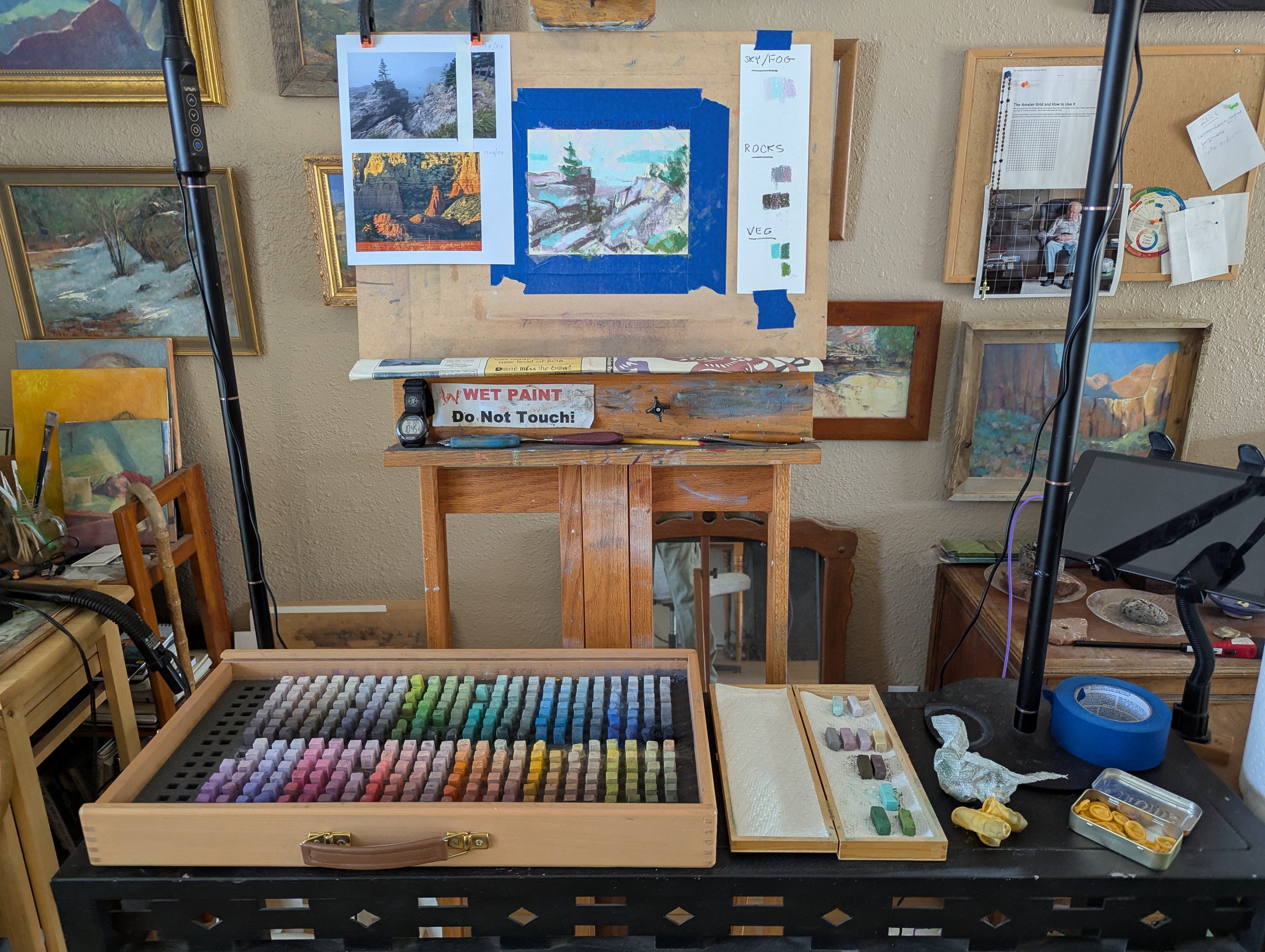
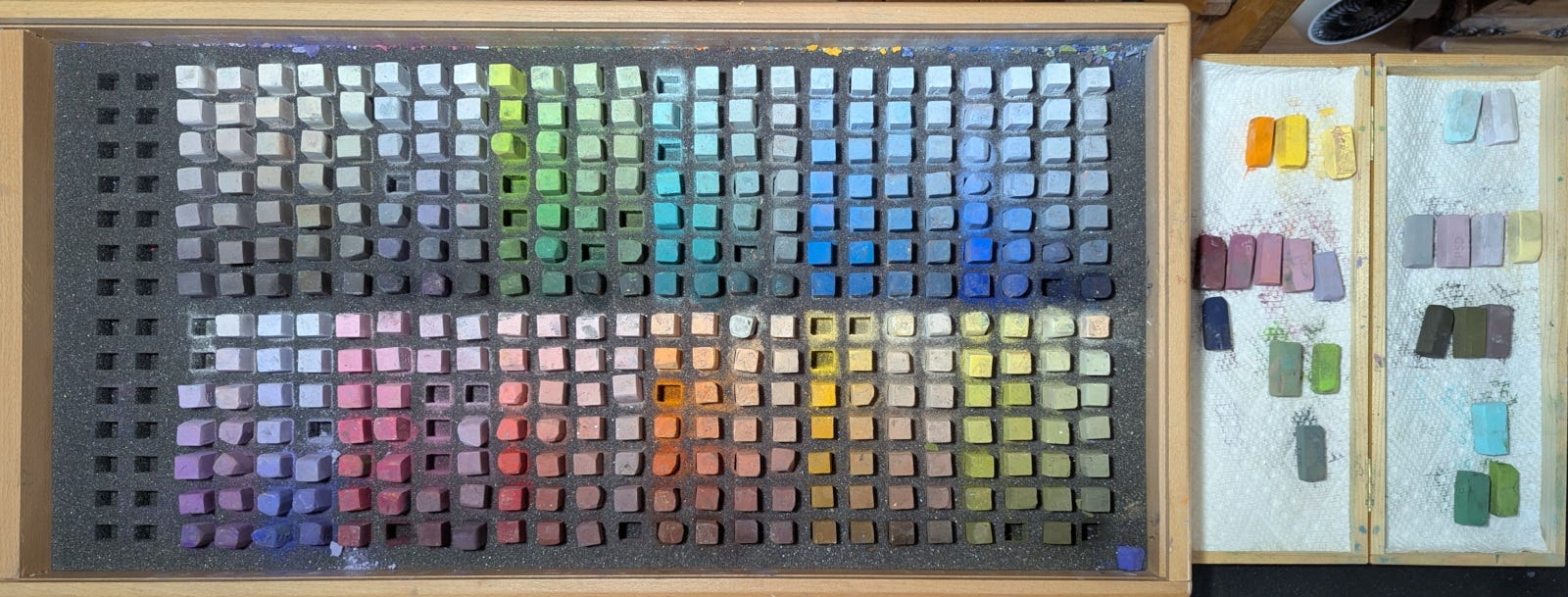
As a followup to last week's demonstration I gave for Art School Live, I thought I'd provide my paid subscribers with the details I didn't have time to give during the hour. One thing I didn't tell you about—couldn't, since my agreement with the producer prevented me from mentioning brands—is the set of pastels I used, which was a full set of Blue Earth pastels. With pure pigments arranged by value, intensity and hue, it was the perfect set because these properties are especially crucial to getting the right color temperature contrast between light and shadow.
Prior to the demonstration, I needed to make color explorations and select the pastels. Also, I felt I needed to practice the two pieces I would paint in a small format. To do this, earlier in the week I set up my backboard with the reference photos taped to the left; then a 6x8 sheet of 500-grit UArt sanded pastel paper; and finally a strip of the same paper to the right.
Keep reading with a 7-day free trial
Subscribe to Painting to See to keep reading this post and get 7 days of free access to the full post archives.