


Gamblin's "Whites" Set
What's the right white?
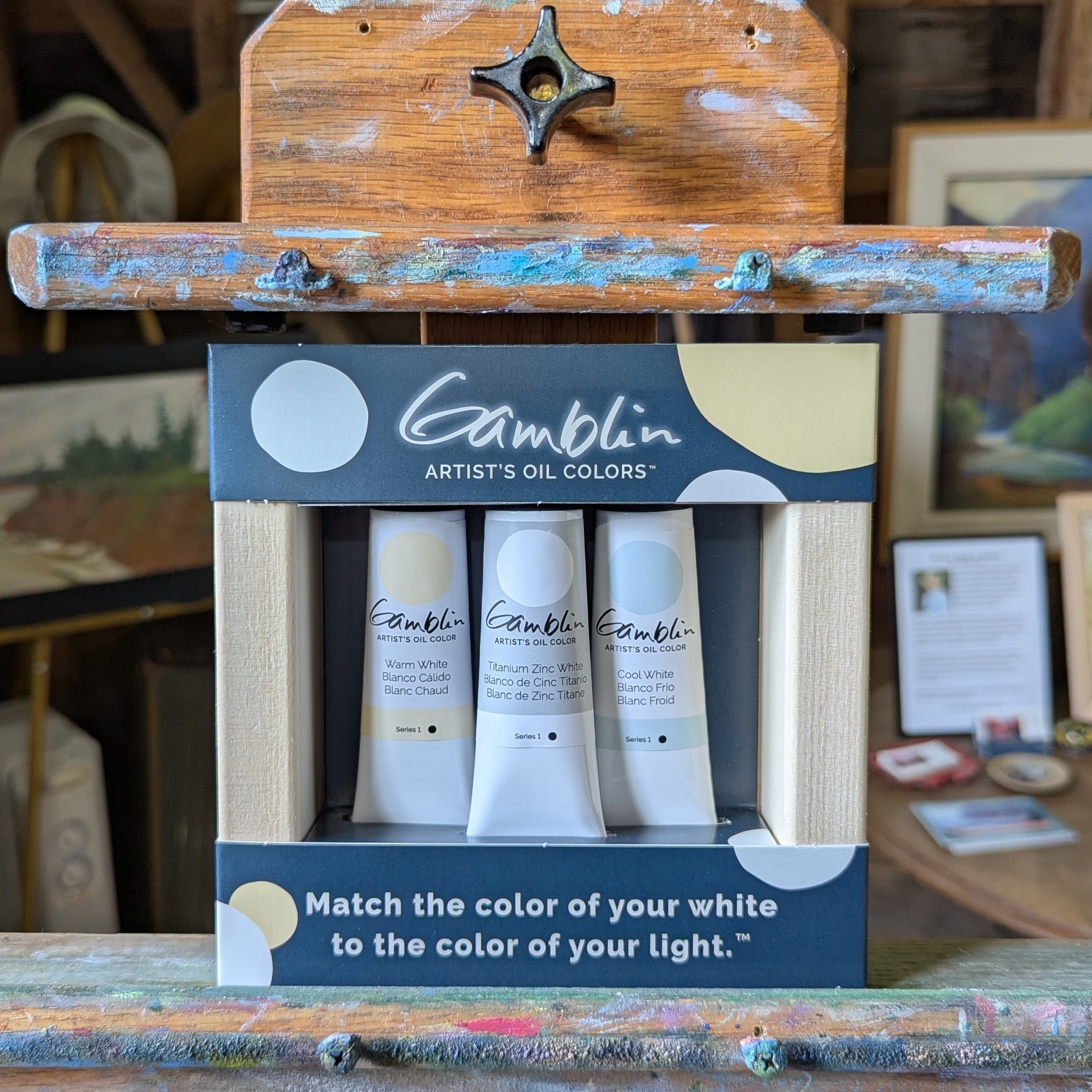
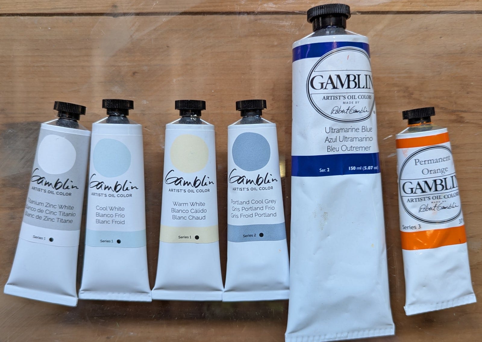
The Artist Grade Whites set contains Titanium-Zinc White, Warm White and Cool White. The warm and cool whites differ from the greys I wrote about in an earlier column in that they are, indeed, white and at the light end of the value scale.
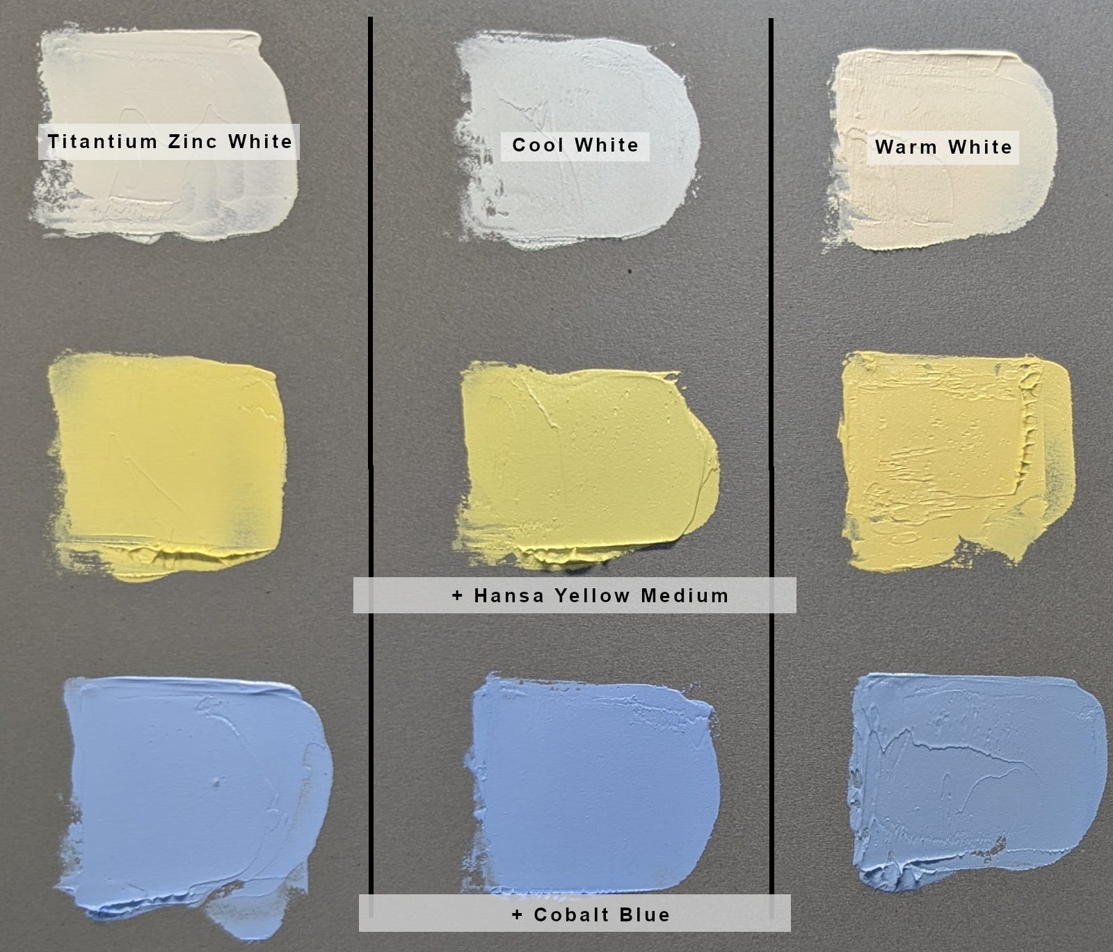
Warm White is a somewhat yellowy-orange tint; the cool, a blue tint. For painting in warm light situations, such as sunrise or sunset, Warm White is perfect for warming color temperatures while preserving undertones. For an overcast day or cool lighting situations, try Cool White, which enhances luminosity while maintaining a cool tonality.
As for Titanium-Zinc White, it's an all-purpose white—it's my "go to" white—and tends to make color mixtures less chalky than Titanium White alone. It also merges the opacity of Titanium White with the lower tinting strength and semi-transparency of Zinc White. Smooth and workable, it makes a good mixing white for almost any technique or surface.
You can read about these colors in the "Whites" section on this page. Here's a chart showing the properties of these colors:

To show you how the temperature of each white affects mixtures, here are swatches showing the raw color mixed with either Hansa Yellow Medium and Cobalt Blue:
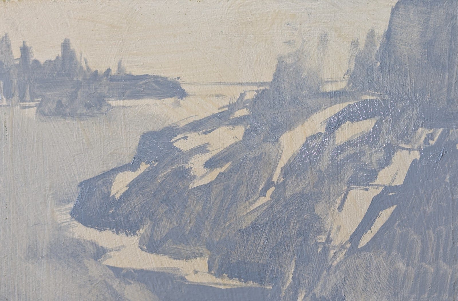
Although you might think you can't use all these whites in a single painting, you can! I tried an experiment in which I used Warm White for sunny areas, Cool White for shaded areas, and Titanium-Zinc White as an accent against the Warm White. (Titanium-Zinc White, a cool white, looks even colder when placed against Warm White, and it makes a perfect contrasting note for glints of reflected sun on warm rocks. It's also a little lighter in value than the Warm White.)
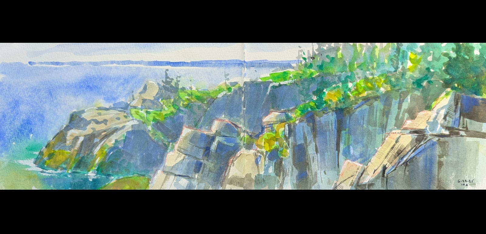
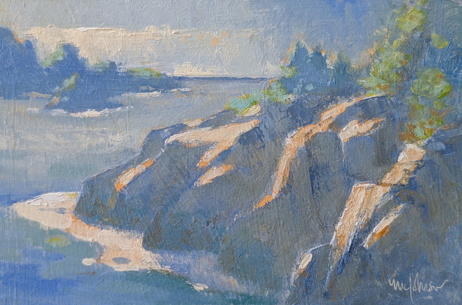
I took this 5x16 gouache sketch and used it as a reference for the painting:
On a 6x9 gessoed board, I lightly sketched a design (very loosely based on my reference) and blocked in shaded areas with Portland Cool Grey. (This grey gave me just the right blue note for underpainting the rocks in shadow.)
I then blocked in sunny areas with a mixture of Warm White + Permanent Orange.
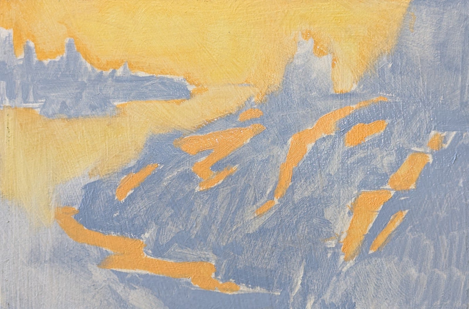
Using Warm White + Ultramarine Blue, I blocked in sky and water. I used Warm White + Permanent Orange + Viridian in the sunlit parts of trees.
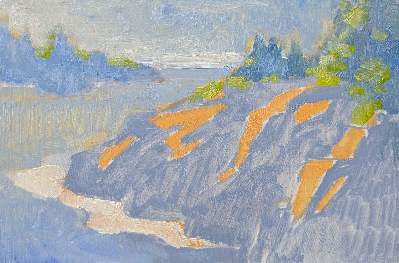
I darkened the shadowed rocks with Cool White + Ultramarine Blue, using touches of Viridian or Permanent Orange for slight color shifts.
With Warm White + Permanent Orange (increasing the amount of white to reduce the intensity of the orange) I repainted the sunny rocks, the foamy water and part of the sky. I also added touches of Cool White + Viridian to add seaweed-covered areas to the rocks. To model the rocks more, I varied the proportions of Cool White + Ultramarine Blue and Cool White + Ultramarine Blue + Permanent Orange for variety in value and temperature in the shadows.
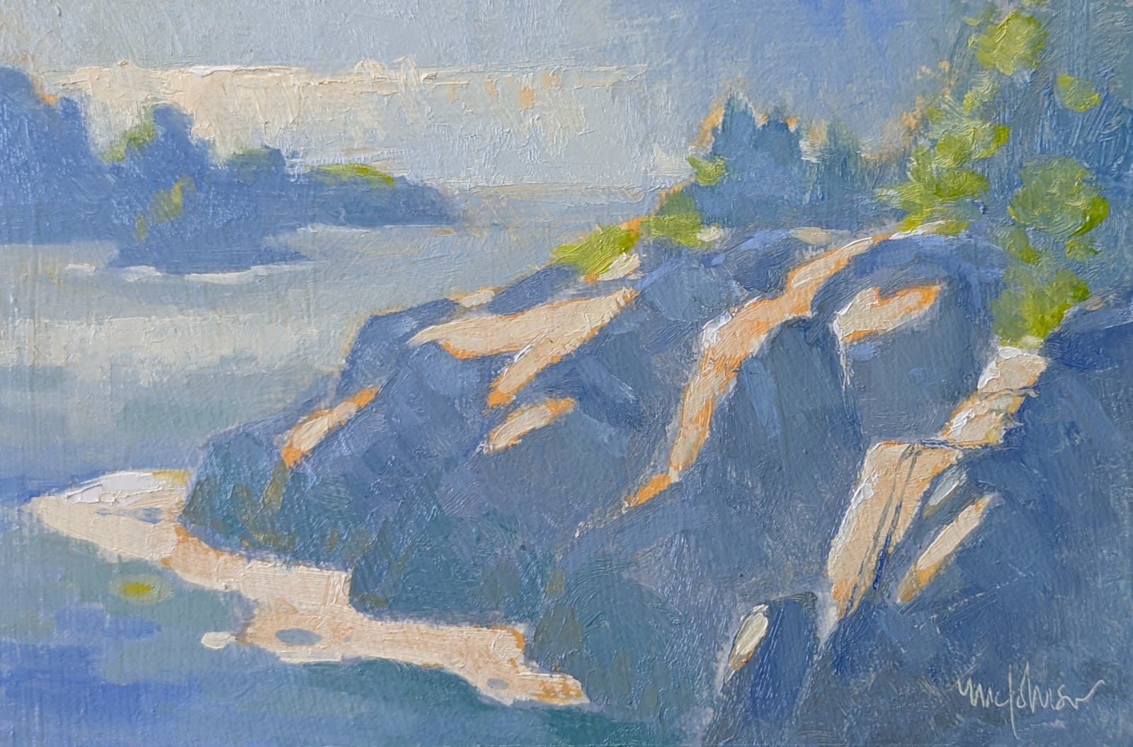
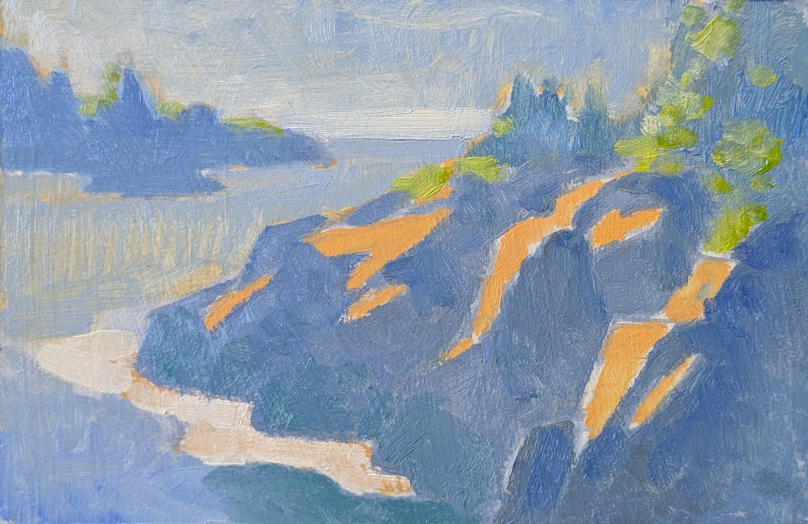
I added more Permanent Orange to the Cool White + Ultramarine Blue + Permanent Orange mixture so to get an even warmer color for the shadowed rocks. (I was determined to not use Warm White in the shadows.) I also modified the sunlit greens with bits of Warm White + Viridian. Finally, to give a "glint" to the sunlit rocks, I used touches of pure Titanium-Zinc White.
Here are the colors I used (forgot to include the Virdian!):
This concludes my review of the three color sets from Gamblin. I hope you found them useful.