

Master Class: Color Palettes and Color Gamut
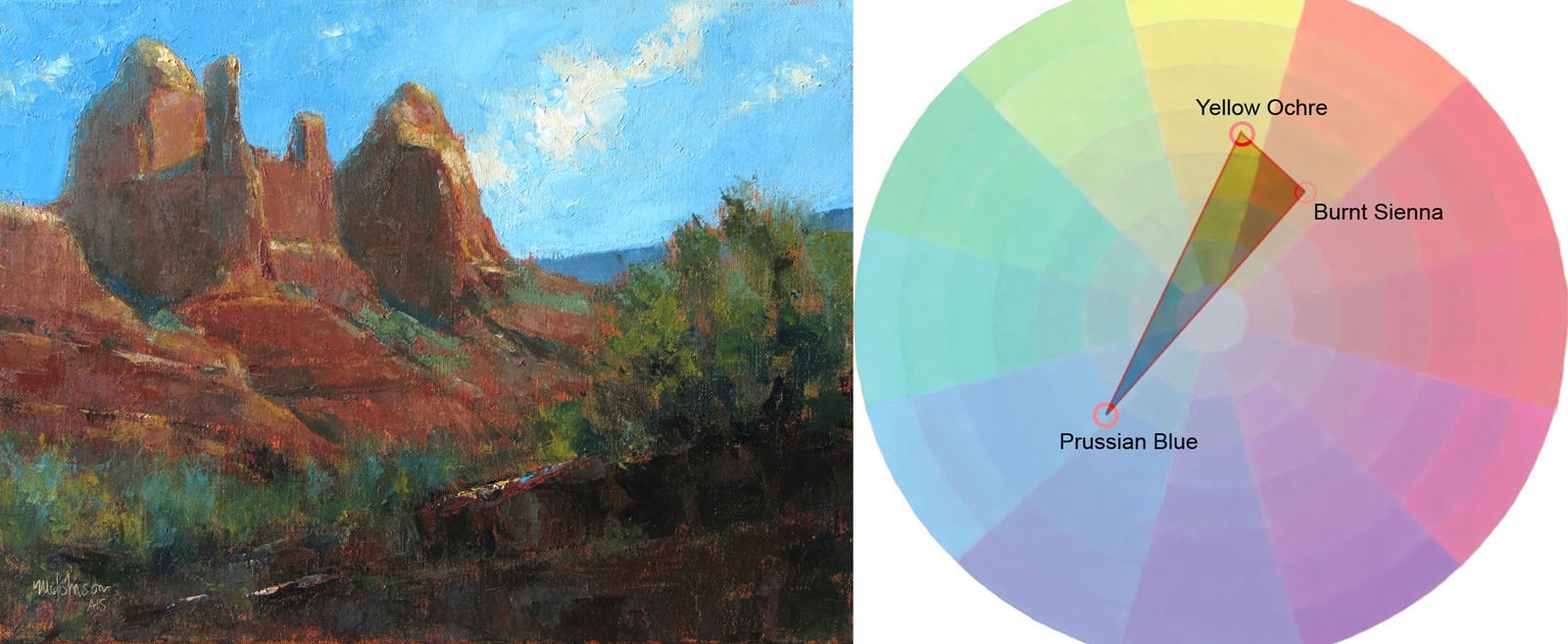
Much basic knowledge is given to children at an early age. I don't remember when I first learned about the three primaries—red, yellow and blue—so it must have been a very long time ago indeed. The concept, as we all know, is that you can mix any color you see with these three colors (plus white.)
Or so the theory goes. Once I started seriously getting into color-mixing with my first painting course, I learned the limitations of red, yellow and blue and of pigments in general. For example, if I didn't have the right red and blue, I couldn't mix an intense violet. I'd be better off buying the intense violet I needed, like quinacridone violet. (By the way, all the colors I use are from Gamblin.)
Keep reading with a 7-day free trial
Subscribe to Painting to See to keep reading this post and get 7 days of free access to the full post archives.