Primer for Plein Air: Part 6 / Making a Proper Value Sketch
Making a preliminary value sketch is waste of time, right? Wrong.
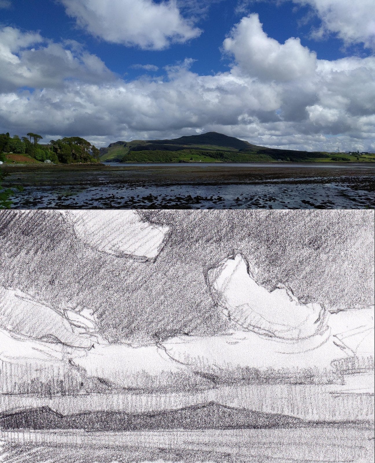
Many of us skip making a value sketch. We're all too eager to get right to the fun part, the painting. But in doing so, we're missing out on a practice that will bring the painting closer to our initial vision. I've found that if I make a value sketch first, I usually end up with a more satisfying result. Here's why.
First, making a value sketch helps me analyze the scene, simplifying it into a few simple shapes of a few values. This creates a map for the placement of shapes. Sure, I could try doing this right on the canvas, but most likely I'll end up having to rework the underpainting until I get the shapes and values right. The result is usually either a palimpsest of overlaid and confused intentions—or mud. I can't tell you how many times I've had to wipe the whole canvas.
Second, by not limiting myself to just one sketch, I can experiment with alternatives to find the best design. Would a 1:3 ratio suit the broad vista I see before me better than a 3:4? What about shifting or compressing the value scale—can I make a stronger statement by darkening some of the lighter areas? And what about moving this hill to the left a bit? Maybe that would help create a sense of rhythm in the landscape.
Finally, the value sketch acts as a warm-up exercise for the final painting. Going through the motions of working out shape and value gets my hand, eye and brain all working together, smoothing the effort I'll make later.
Tools for Making a Value Sketch
Cropping tool. Something like the ViewCatcher, which lets you adjust the dimensions to match the proportions of your canvas, will make sure that the placement of elements in your sketch will look the same in the painting.
Small sketchbook. I like one that's 3"x5". Anything bigger, and I'm tempted to draw in detail.
A sketching tool. I prefer a 6B pencil, because with it I can make both very light and very dark marks and "sneak up" on my dark values. Some artists prefer a set of grey felt-tip markers in different values (like 20% grey, 50% grey, 90% grey) but I feel the markers lock in the value structure too soon when I'm playing with value relationships.
How to Make a Value Sketch
Draw a box on a page in your sketchbook, and keep it small. This will help you focus on simplicity.
Make sure the box matches the proportions of your canvas. If you're painting a 9x12 canvas, your box needs to be 3:4.
Use your cropping tool to isolate your scene from it surroundings.
Squint to help simplify the shapes you see.
As you work on the sketch, don't draw with lines but make shapes.
Keep the sketch "blocky." Again with the simplicity! But do fill the shapes in solidly with three or four values.
To fill in the shapes, use a medium (like a 6B pencil) that allows you to "sneak up on" the darks. First, preserve the white of the paper for the shapes with the lightest value. Then, for all the other shapes, block them in with a mid-value. Toward the end, darken the mid-values as needed but do so cautiously. Avoid going too dark. Make sure you maintain the simplicity of three or four values.
Punch in the darks at the end.
Once you've got your design and values nailed down, you'll be ready to forge ahead into the wonderful world of color with confidence.
At the bottom of this post is a gallery of possible value sketches.
By the way, going out with the goal of doing nothing more than making value sketches is a powerful, skill-building exercise. Plus, it can be more relaxing than actually painting!
Next time: Starting a Painting
Don't forget that I offer several Plein Air Essential courses that will give you more guidance on getting started! They are online, self-study and self-paced. You can check them out on this page.


