

Chirality and Composition
What Works Better, Right or Left?
[At the moment, I’m in Sedona, Arizona, participating in the Sedona Plein Air Invitational. I’ll give a full report once I’m back, but for now, enjoy this column. Also, I’ll be posting images from the plein air event to my Instagram account, so you might want to follow me there, as well.]
Did you know that left- and right-handedness can make a big difference in biochemistry? I know this is an art column, not a science column, but bear with me a moment, because I have the same question regarding composition in painting.
Some molecules come in both left- and right-handed versions, a property known as chirality. A molecule is a three-dimensional object, and sometimes there’s a mirror version of it.
Why does this matter? Well, one molecule very important to human existence is glucose, which provides our bodies with raw energy. It turns out we can’t process its mirror version. The mirror version is like a jigsaw puzzle piece from the wrong puzzle–it just won’t fit. Although they look similar in that they have the same chemical formula, C₆H₁₂O₆, the spatial arrangement of the atoms differs. Our bodies can only use the right-handed version; although the left-handed one tastes just as sweet, it is useless for powering our muscles.
Now here comes my question: Does chirality also matter in composition? If you made a mirror version of a composition, would it make any difference in impact or the emotional response it provokes?
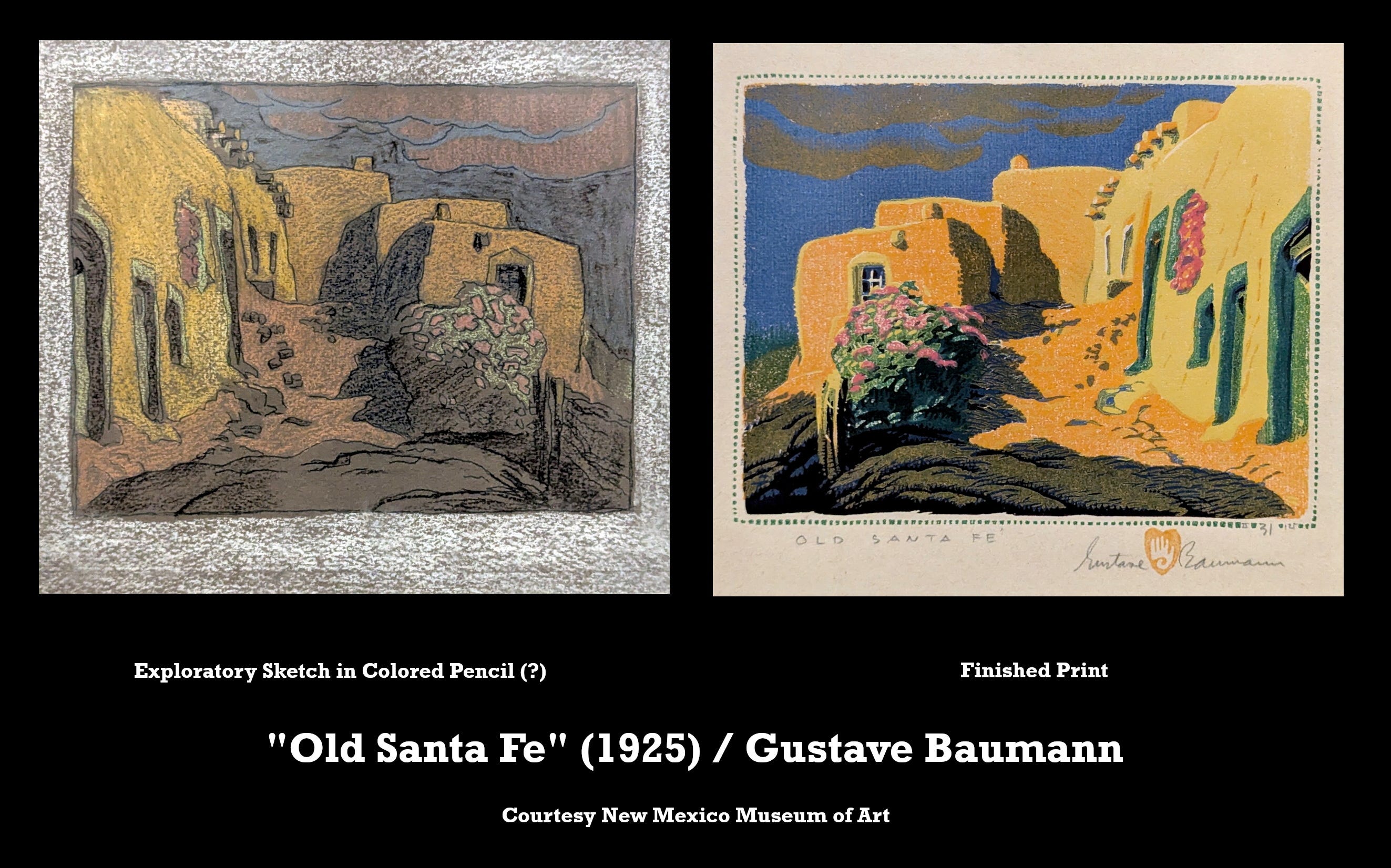
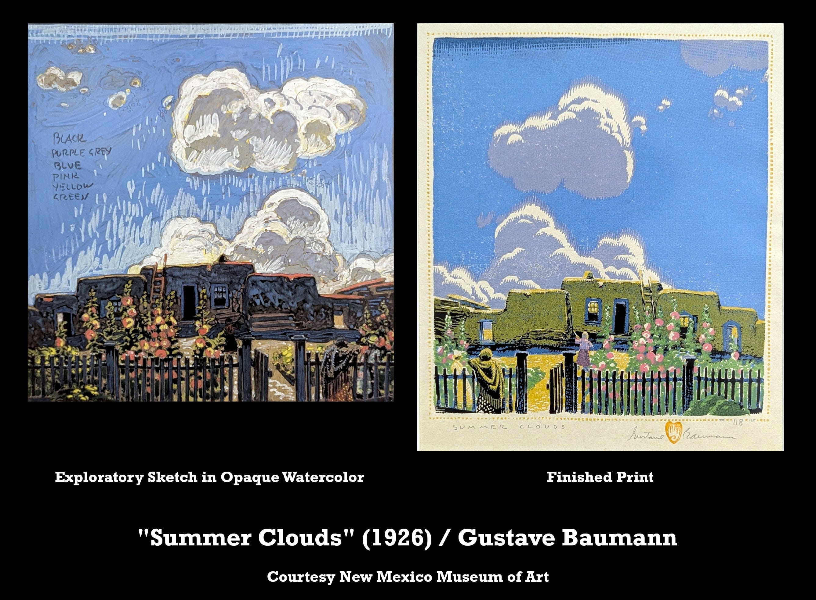
What prompted these thoughts is a wonderfully comprehensive exhibition of the prolific and multi-talented Gustave Baumann that I saw recently at Santa Fe’s New Mexico Museum of Art. (The exhibit continues through February 22, and you can read more about it here.) Included in the exhibit are many of his stunning color woodcut prints featuring not just Southwestern landscapes but other places he’s lived in or visited, plus some of his stage sets and marionettes. But it was the woodcut prints that caught my eye.
The exhibit includes, in addition to the prints, some of the woodblocks themselves. Although I know that prints always present a reversed image of what’s on the blocks—they are mirror images—because some of the blocks were hung right beside the resulting prints, I became particularly fascinated with this compositional difference between print and block.
When Baumann was in the field sketching a scene, he drew it as he saw it. When he went to the studio to explore the design, he seemed to continue with the general initial arrangement of shapes without taking into consideration that the final printed result would be reversed. Yet there it is: Because of the reversal, the final result is, in fact, a different composition.
But does it matter? Do we perceive the mirror image differently from the original compositition? Does the design “flow” naturally? Does it “feel” any different to us, perhaps evoking a different emotion?
Maybe. Consider how different cultures write and read. Most Western cultures read left-to-right; Middle Eastern cultures, right-to-left; and East Asian cultures, top-to-bottom. Interestingly, this tendency spills over into how they scan and create images. Each culture tends to favor a visual “flow” that follows the scan direction. In LTR cultures, movement from left to right feels “forward” or “progressive.” In RTL cultures, the reverse is true, with right-to-left motion feeling more natural. In TTB cultures, verticality and cascading elements dominate traditional compositions.1
I don’t have an answer to my questions. I’m curious to know if any of my readers have one.
As a visitor to the museum, seeing the block presented adjacent to the final, mirrored print, although instructive, was unsettling. I had a moment of dissonance as I was presented with two irreconcilable realities. If I’d seen just one or the other and not both, I would have simply appreciated the art and moved on to the next masterful image. But instead, we now have this essay.
Here are some references to this interesting fact:
https://www.braddailey.com/flow-visual-hierarchy
https://www.grc-health.com/knowledge-centre/the-anatomy-of-reading-how-scripts-shape-the-way-we-read
That is an interesting question and one I'm not sure I can answer. I had the opportunity to see Baumann's work in a small museum local to me. It was fascinating. I also saw both the sketch and print side by side. I didn't feel the same dissonance you described. I think I was more interested in how he could make the prints at all with all the color variations and keep the registration correct. Thanks as always for giving us something to ponder.
Nice!