

Learning Color: Palette Scout
A new way to come to grips with color harmony
In 1666, Sir Isaac Newton used a prism to split a beam of sunlight into a beautiful rainbow. Since then, color scientists have wrestled with exactly how many colors there are and how they can best be represented in a chart. Newton first thought there were five, but then he decided on seven, which he arranged into the first color wheel. Poet and chromatician Johann Wolfgang von Goethe, in his 1810 treatise, Zur Farbenlehre (Theory of Colors), reckoned there are twelve—three primaries, three secondaries and six tertiaries. He created the "traditional" color wheel that most of us are familiar with today. Then artist and teacher Alfred Munsell, in A Color Notation (1905), pared the colors down to ten—five primaries plus five secondaries—but decimalized each color further, for a total of one hundred. He also pushed the wheel into three-dimensional space, imagining a cylinder that incorporates not just hue but also value and intensity.
Now along comes Palette Scout. Zollie, the company that makes it, describes the product as:
A playful, open-ended experience for artists and makers of all ages. Palette Scout is a fun, intuitive way to learn about color, with 180 colors to combine into color palettes and eight challenge cards to help you break out of your comfort zone.
Although the makers of Palette Scout have chosen to split the spectrum differently, into 18 hues rather than the traditional 12, from a color learning perspective, it doesn't really matter—it's still Nature's full rainbow of colors, and all the familiar guidelines regarding creating harmony still apply.
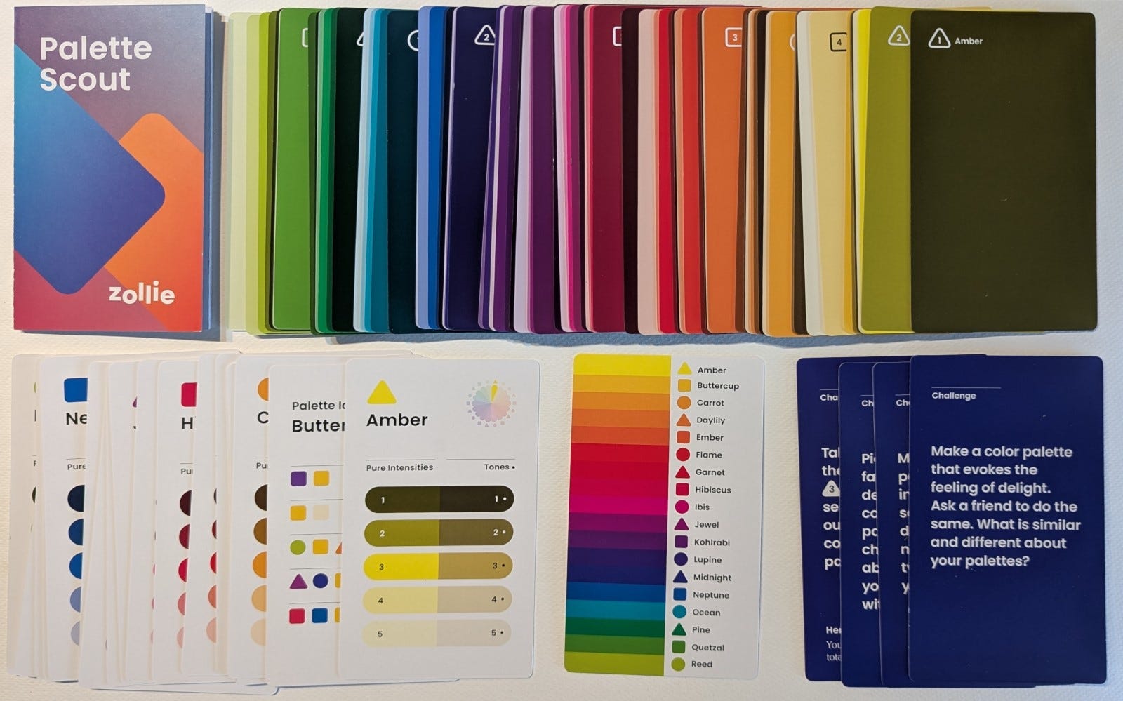
Palette Scout consists of a 180-card deck with each hue represented in five intensities (the highest chroma plus two tints and two shades) and in five tones (the color with varying amount of grey added.) Each hue has an icon associated with it—triangle, square or circle—which is helpful in picking a palette. Although the package doesn't really address the concept of primary or secondary colors, the triangles identify what Palette Scout might consider to be six primaries: amber (yellow), daylily (orange), garnet (red), jewel (violet), midnight (blue) and pine (green.) Between each triangle color are two other colors, each assigned either a square or a circle. One might consider these to be two secondaries between each primary. For example, between amber and daylily, you have buttercup and carrot, each some variation of yellow mixed with orange.
Although this breakdown of color isn't what many of us painters are used to, the arrangement works just fine. With Palette Scout, you still use basic color harmony concepts to create different palettes: complementary, split-complement, triadic or analogous. To help with selecting colors, each of the 18 colors also has a corresponding reference card that shows what other colors will work with it to create a harmonious palette.
For example, to create a complementary palette, simply pick opposite colors on the color wheel in the included, helpful guide. Of course, because the deck uses 18 colors rather than 12, the complements won't be quite the same as the ones on the traditional color wheel. But again, this doesn't really matter, since what's more important is how the colors look together. And that's the beauty of the Palette Scout—it gives you a visual way to create color harmony in a pleasing way.
Palette Scout uses designer color names rather than ones painters commonly use. For a complementary palette composed of yellow and violet, you'll be looking at amber and jewel. For a triad, perhaps buttercup, kohlrabit and neptune. I recommend painters consider the names to be stand-ins for names we are more familiar with, like red-orange or Hansa yellow deep. Once you pick a palette, it's an easy matter to go to your paints and simply match what you see, instead of trying to correlate designer names to paint names.1
I found creating different palettes with the cards a fun and useful exercise. And if you're new to painting and not familiar with color harmony concepts, they're an excellent way to learn about color without the mess of dealing with actual paint. You can play all you like with the cards and keep your fingers clean—and once you've settled on a palette, you'll find it easy to go to your paints and pick colors to match. And by the way, if you run out of ideas, the deck includes "challenge cards" that are written to spark new ones. This is a helpful tool for even an old hand like me.
You can find out more about Palette Scout at this link. Finally, here is a short video from Zollie that gives more detail on Palette Scout, followed by a gallery of images that show different parts of the pack:


When I was reviewing the Palette Scout, I suggested to the company that they might consider putting the Pantone number and RGB/hex code somewhere on each card. Here is their response:
Unfortunately, we can't provide Pantone matches due to trademark legalities, and we thought the inclusion of hex codes directly on the cards might be a bit distracting to folks unfamiliar with that naming system. As a compromise, we created a series of PDF Matching Guides, including one that has all the Hex codes. You can find that guide (and all the rest!) here.
If you notice, we don't have any matching guides available for paint brands—we’re working on that. Since blending and mixing is such a huge component of painting, we're making a paired-down version of these color matching guides to accompany our new color mixing course, Infinite Palette: Color Mixing 101. These guides will match paints to the double primaries in our Palette Scout deck so they can be used for reference in mixing up all the different colors of the Palette Scout deck.
Interesting, and colorful :) though my brain had intensity and tones the other way around and is now mildly confused, haha (could also be lack of sleep / reading this before coffee)